
Product Hunt’s September 12 board was unusually coherent for a day with this much variety. A common thread ran through the top launches: products were trying to remove friction from work that already exists, rather than inventing entirely new categories. Sales teams wanted the next best move, developers wanted a faster path from spec to usable tooling, creators wanted less repetitive production work, and Mac users wanted their desktops and calendars to behave with more personality and less forgetfulness.
That makes this a useful launch day for founders to study. The highest-ranked products did not simply announce that they were powered by AI or open source or built for professionals. They made a narrow promise about a painful workflow, then backed it up with a concrete mechanism. The vote totals and comment counts suggest that Product Hunt voters responded most strongly to products that were easy to understand in a single sentence, but still felt opinionated enough to be memorable.
1Youkti
 Youkti opened the day at rank 1 with 327 votes and 53 comments, and the result makes sense once you look at how it framed itself. This is a sales tool, but not the kind that tries to be everything at once. It keeps a memory of every account, conversation, and deal, then tells AEs, RevOps, and outbound reps what to do next. The description is concrete in a way that sales software often is not: it calls out slipping deals, dormant accounts that have suddenly signaled intent, and tomorrow’s meeting prep.
That specificity likely helped it rise above the generic “AI for sales” category. Instead of claiming to revolutionize revenue, Youkti describes a working system around signals, contact data, and next actions. The fact that it offers contact data, buying signals, and intent for free, with no card and no meter, probably lowered the friction for curious voters who wanted to see whether it really felt different. On a day with many practical tools, Youkti stood out because it promised not just insight, but a very immediate sense of direction.
2Cortex
 Cortex came in at rank 2 with 291 votes and 32 comments, and it leaned into infrastructure rather than splashy positioning. It calls itself an open source API knowledge layer, which is a dense phrase, but the value becomes clear quickly: it turns OpenAPI, AsyncAPI, GraphQL, gRPC, and OpenRPC specs into interactive documentation, typed SDKs in 11 languages, and MCP servers for AI agents. That is a strong bundle for teams that need APIs to be both documented for humans and usable by machines.
What likely helped Cortex stand out was the way it connects several developer pain points into one release. Documentation, SDK generation, and agent readiness are often treated as separate problems, but this launch wraps them together into a single workflow around specs. The open source angle also matters here, because Product Hunt audiences tend to respond when a tool feels adoptable rather than locked away. Its vote count shows real curiosity, while the comment count suggests builders were engaging with the practical implications of the stack.
3QApilot MCP for Android
 QApilot MCP for Android landed at rank 3 with 207 votes and 40 comments, which is a strong showing for a product aimed at a fairly technical audience. Its pitch is straightforward once you decode the acronym: it automates tests on real Android devices and emulators by talking to Claude, Cursor, or Codex. Rather than asking teams to write Appium code, it lets them describe test flows in plain English, then has the agent plan the steps while QApilot executes them. It also saves a Gherkin feature file after each pass, turning a run into a reusable test case.
That blend of agentic control and practical output is probably what resonated. Developers do not just want a demo of “AI testing”; they want repeatability, and QApilot leans into that with cached learning, retries when UI elements move, and replayable cases. The requirement for Node, Java, and the Android SDK signals that this is not a toy, which can actually help on Product Hunt when the audience is technical enough to appreciate the constraint. The comments likely reflected that same interest in how much of the testing burden it can truly remove.
4ABrush
 ABrush reached rank 4 with 144 votes and 22 comments, and it positioned itself squarely inside the creative workflow rather than around the edges of it. Marketed as an AI studio for digital artists, it brings leading AI models and advanced workflows into the environment where artists already work. The message is less about replacing creative labor and more about stripping away repetitive production work so artists can spend more time making decisions that actually matter. The line “created by artists, for artists” reinforces that framing.
That positioning is important because creative tools often fail when they sound like generic automation. ABrush appears to have understood that the audience wants speed without surrendering control. The vote total is respectable, but the comment count suggests the launch may have sparked discussion about the balance between efficiency and authorship, which is a live issue in AI-assisted art tools. In a crowded product day, ABrush benefited from a simple promise: faster iteration, lower routine cost, and the artist still in charge of the final result.
5Calerto for Mac
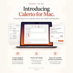 Calerto for Mac finished at rank 5 with 121 votes and 14 comments, and it solved a problem almost everyone recognizes: missing meetings because calendar notifications are too easy to ignore. Calerto turns calendar events into full-screen meeting alerts, adds custom prep time per meeting, syncs with Apple and Google Calendar, and shows a menu bar countdown to what is next. It also launches at login automatically, while keeping the calendar data on the device.
This is a classic example of a narrow utility earning attention by being more forceful than the default tools users already have. The product does not ask people to change their scheduling habits; it simply makes the consequence harder to miss. The “never be late again” promise is bold, but the product mechanics are specific enough to feel believable. A modest comment count suggests the launch was appreciated for clarity more than controversy, which makes sense for a Mac utility that is easy to grasp in seconds.
6Kabza
 Kabza arrived at rank 6 with 117 votes and 14 comments, and it brought a different energy to the board. Instead of selling productivity or infrastructure, it turns real city maps into a competitive game. Players can take over Noida, Delhi, Gurugram, or Bengaluru, drag to send supporters, capture territory, and try to hold 75% of the map to win. It supports solo play against bots or a room of up to eight, and it is free in the browser with no download or account required.
That low-friction setup likely did a lot of work for it. A game that can be tried instantly has a better chance of earning casual votes than one that asks for installation or onboarding. The maker’s personal handle, along with the concrete city-based framing, makes the launch feel rooted in a specific playful idea rather than an abstract game platform. The vote count shows that Product Hunt users were willing to make room for something fun in between the more work-focused launches, especially when it promised an immediate, social experience.
7Marked Share
 Marked Share took rank 7 with 100 votes and 6 comments, and it is one of the more quietly useful launches of the day. It is a way to share Markdown and TextBundle documents with images and attachments, let others highlight and comment on them, and even publish blog feeds with RSS, Atom, and Micro.blog integration. It is a subproduct of Marked 3, but it does not require Marked to use, which broadens its appeal beyond existing users of the parent app. It also offers a built-in editor and a full API for integration.
The launch works because it focuses on a workflow that many writers and developers know intimately: moving text around without breaking its structure. Marked Share is not trying to be a generalized collaboration suite, which probably makes it easier to understand and trust. Brett Terpstra’s presence as maker likely added credibility for people already familiar with his tooling. The low comment count suggests the product was immediately legible to the people it was built for, which is often a sign that a launch has hit a genuine niche.
8DockFix 5.0
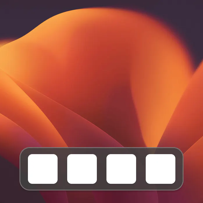 DockFix 5.0 came in at rank 8 with 99 votes and 5 comments, and it speaks directly to the kind of user who wants their desktop to feel less generic. The product replaces the macOS Dock with one that is fully customizable, including colors, icons, animations, widgets, window previews, and a file shelf. The framing is simple and personal: make the Dock truly yours.
What likely helped here is that the pitch instantly tells you who it is for. This is not a broad-system utility; it is a design-forward customization tool for Mac users who care about appearance and workflow in equal measure. The vote count is close to the launches around it, which suggests a steady level of interest even without a huge discussion thread. It fits a recurring Product Hunt pattern where deeply opinionated desktop tools can outperform more generic utilities because they offer identity as much as function.
9Wokyintosh
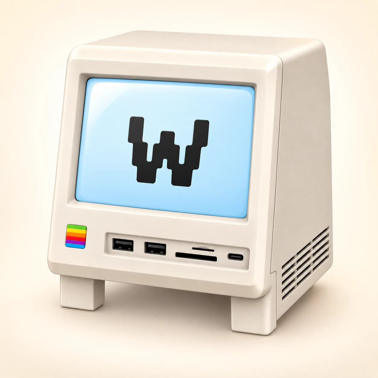 Wokyintosh ranked 9 with 94 votes and 9 comments, and it feels like a product made from a very specific frustration. It turns a spare Mac display into a retro system dashboard inspired by the classic Macintosh. The dashboard includes a large clock and date, local weather, Apple Music and Spotify now playing with artwork, plus live CPU, RAM, SSD, and network stats. The maker notes that it was built for a Wokyis M5 Retro Dock Station after months of not finding the right dashboard, even among paid apps.
That origin story likely carried the launch. People tend to respond when a maker describes a real unmet need instead of a vague market opportunity. The product also sits at the intersection of nostalgia and utility, which is a potent combination for a visually driven launch. The comment count is slightly higher than some of the other lower-ranked products, suggesting that the audience saw it as more than a novelty. It is a personalized dashboard with a clear use case, and that specificity gave it room to land.
10Stackness
 Stackness closed out the top 10 at rank 10 with 92 votes and 14 comments. The product is aiming to become a social home for dev tools, where developers and vibe coders can show the tools, workflows, and approaches they build with. Users can create a stack profile they share as one link, post updates, follow people whose taste they trust, and watch tools rise and fall. It is also free and includes an MCP server.
The positioning is interesting because it turns tools into a social object rather than just a utility purchase. That can work on Product Hunt, where people already like browsing what others use and recommend. The “show your stack” angle is instantly understandable, and the inclusion of an MCP server gives the product a technical edge that makes it feel current rather than purely social. The comment count suggests people may have been thinking about whether this becomes a useful discovery layer or simply a new kind of profile page, but the launch clearly tapped into the ongoing appetite for taste-driven developer identity.
What founders can learn from this launch day
The strongest launches on September 12 all shared one trait: they reduced a messy workflow to a visible next step. Youkti did it for sales teams, Cortex did it for API teams, QApilot did it for mobile testing, and Calerto did it for meeting fatigue. None of them relied on vague category language alone. They told visitors exactly what problem they would remove from the day, then showed the mechanism in enough detail to feel real.
Another lesson is that specificity still wins attention. The most effective positioning was not broad praise for AI, open source, or customization, but a narrow promise tied to a recognizable user job. That is why the day’s launches could span sales, developer infrastructure, creative work, games, and desktop tools without feeling random. Each product had a clear user, a clear use case, and a clear reason to exist now.
The vote and comment patterns also suggest that Product Hunt audiences respond to products that balance instant clarity with some depth underneath. The launches with the most engagement did not ask readers to imagine a future platform. They offered something inspectable: a memory of accounts, a spec-to-SDK engine, a plain-English test runner, a full-screen reminder, or a custom Dock. For founders, the takeaway is simple. If your launch day story can be understood in one breath and still reward a second look, you have a much better shot at breaking through.
